All You Need To Know About CSS
Basics of CSS
Websites are one of the most important aspects of your brand’s online presence.It is important that we design it right. The website should be designed keeping in mind the users and should ensure that it provides a good user experience. CSS helps web developers to style the website so that the users can have a great user experience.
CSS Stands for Cascading Style sheet , Before we Learn about CSS we have to understand what is CSS . is it a language ? or what ? . yes it is a style sheet language .
In web development, HTML (Hypertext Markup Language) is used for structuring the content of a webpage, while CSS is used to control the layout, formatting, and visual styling of that content. it also provide proper alignment to each element on webpage.
CSS will provide you some feature like Flex-box , Box-Model etc by using which we can create very beautiful websites. with only a few changes in
CSS code. CSS is a core technology in web development.
Why CSS ?
● CSS specifies the presentation of HTML documents.
● This includes colors, backgrounds, fonts, spacing, animations, etc.
● It works on all devices: desktop, tablet, mobile, etc.
● CSS is lightweight and relatively easy to learn.
● CSS along with HTML are essential skills for web developers.
Different ways to bring CSS into the HTML file —
- Inline styling.
- Internal styling.
- External styling.
Inline styling
Inline styling is a technique in HTML that allows you to apply style directly to an HTML element using the ‘‘style ’’attribute. It is called “inline” because the style is applied directly to the element, in the same line of HTML code.
Inline styles have the highest specificity, meaning that they will override anyother styles that are applied to the same element.
It is also possible to use JavaScript to modify the style attribute of an element and change its styles dynamically.
<body style="background-color: bisque;">
    <h1 style="color: red; font-family: Arial">Hi This is Internal Style</h1>
  </body>
Internal styling
Internal styling refers to the practice of using a style element within the head of an HTML document to define styles for the elements on the page. The style element should contain a list of CSS rules that specify the styles for the elements on the page.
To use internal styling, you should place the style element within the head of the HTML document, and include your CSS rules within the style element. You can then apply the styles to the elements on the page using CSS selectors.
<head>
<style>
h1{
color: black;
font-family: Arial, Helvetica, sans-serif;
}
p{
font-family: Arial, Helvetica, sans-serif;
color: blue;
}
</style>
</head>
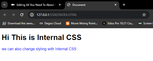
<body >
<h1>Hi This is Internal CSS </h1>
<p>we can also change styling with Internal CSS</p>
</body>
External Styling
External styling refers to the practice of linking to an external CSS file from an HTML document using the link element. The link element should be placed within the head of the HTML document, and it should have a rel attribute with a value of“stylesheet” to indicate that it is linking to a style sheet.
To use external styling, you should create a CSS file and define your styles in that file. You can then link to the CSS file from your HTML document using the link element.
<head>
<link rel="stylesheet" href="INDEX.CSS">
</head>
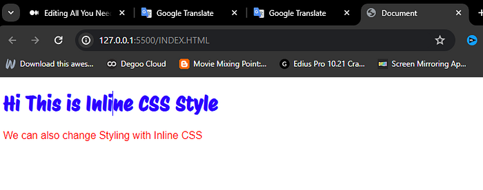
<body>
<h1 >Hi This is Inline CSS Style</h1>
<P >We can also change Styling with Inline CSS</P>
</body>Advantages of Inline CSS:
- Inline takes precedence over all other styles. Any styles defined in the internal and external style sheets are overridden by inline styles.
- You can quickly and easily insert CSS rules into an HTML page, which is useful for testing or previewing changes and performing quick fixes on your website.
- There is no need to create an additional file.
Disadvantages of Inline CSS:
- Within inline CSS, quotations are not permitted. The browser will perceive the use of quote marks as the end of your style value.
- These styles can’t be applied elsewhere.
- Because they are not saved in a single location, these styles are difficult to update.
- Pseudo-codes and pseudo-classes cannot be styled with inline CSS.
- Inline CSS does not provide browser cache advantages.
Advantages of Internal CSS:
- IDs and classes can be used in internal style sheets.
- You do not need to upload numerous files.
- They might take precedence over outside style sheets.
Disadvantages of Internal CSS:
- They are useful for only the page they are specified on.
- Internal style sheets increase page load times.
Advantages of External CSS:
- The style of several documents can be controlled from site by using them.
- Multiple HTML elements can have many documents, where classes can be created.
- To group styles in complex situations, selector and grouping methods are used.
Disadvantages of External CSS:
- Extra download is needed to import documents having style information.
- To render the document, the external style sheet should be loaded.
- Not practical for small style definitions.
Importance of CSS Priority —
- The Priority of CSS is very Important because it determines which style are applied to an element when there are conflicting rule or multiple CSS applied to a Single element. -In this case ‘‘Inline Style’’ Have highest Priority.
Changing the priority order
- If you want the rules in the external stylesheet to be prioritized over the rules in the internal stylesheet, you should include the external stylesheet after the internal stylesheet in the head of the document.
- It’s generally a good idea to use external stylesheets for most of your CSS, and only use internal style sheets in specific cases where you need to override those styles. This helps to keep your styles organized and maintainable.
Introduction to CSS Selectors—
Why CSS Selectors are made, What are these ? As it Name suggested that ‘Selector ’ we use these for selecting something(HTML elements) .Selectors makes easy for us to easily target Single / Multpile HTML elements in the markup.
CSS selectors are used for selecting the HTML elements that you want to style, and they are a fundamental part of working with CSS. In theory, selectors are patterns used to select the elements to which a set of styles will be applied. CSS selectors can be used to select elements based on their type, class, ID, attributes, or dynamic state or position.
We can divide CSS selectors into five categories:
- Simple selectors.
- Combinators.
- Attribute selectors.
- Pseudo-class selectors.
- Pseudo-elements selectors.
Simple Selectors
A simple selector is either a type selector or a universal selector. Simple
selectors are pretty straight forward and used most of the time in
development.
- Universal Selector:-The universal selector(*) applies the same styles to every element on the page.
- Element Selector:- The Element Selector only selects all the instances of a tag or element present on the webpage.
- Class Selector :- The CSS class selector is probably the most useful and used selector, it selects all elements that have given the class value in their class attribute. To select elements with a specific class, write a period (.) character, followedby the name of the class.
- ID Selector :- ID selectors are the most powerful in terms of CSS specificity, just like the class selector, it targets specific elements in our HTML document that we can then use as a reference in our CSS. To select an element with a specific id, write a hash (#) character, followed by the id of the element. We can also use Id`s for generating links.
NOTE : By Defination IDs must be always unique and each element must have only one id to identify the element uniquely.
- Selector list :-The CSS selector list (,) allows us to select multiple elements with different selectors at once and style them. We have more than one thing which uses the same CSS then the individual selectors can be combined into a selector list so that the rule is applied to all of the individual selectors. This is done by grouping them in a comma-separated list and CSS selects all the matching elements in the list.
Ex- .P , h1 , #ID{ color : Pink }
Lecture CheckList
- CSS Combinators.
- Attribute Selectors.
Combinator Selectors include — A CSS selector can contain more than one simple selector. Between the simple selectors, we can include a combinator.
- Descendent selector:- This selector allows us to select elements that are descendants of some other selector. The descendant selector uses a space character to target an element that is a descendant of another element.
Ex- main p { color : red }
- Child selector:-The child selector is also called a direct selector. It can only target the direct or immediate child of the parent selector.
Ex- main >p { color : red }
- Adjacent sibling selector:- The + combinator selects adjacent element siblings.It will select only the element that is immediately after the mentioned element.
Ex- Section+p{ color : red }
- General sibling selector:-The CSS general sibling selector is used to select all elements that follow the first element such that all are children of the same parent.
Ex- Section ~ p{ color : red }
- Attribute selectors:-The [attribute=”value”] selector is used to select elements with a specified attribute and value.
Ex- [attribute=’value’] { color:Blue;}
- [attribute~=”value”] Selector:-The [attribute~=”value”] selector is used to select elements with an attribute value containing a specified word.
Ex- [attribute~=’value’] { color:Blue;}
Google Fonts (Bring External Font) —
Before We understand how to Bring Different fonts in HTML. we need to understand Why we need to change font style on our webpage.
Fonts are an essential aspect of design and can greatly affect the look and
feel of a website or document.They can also play a role in how easily the content is understood and absorbed by the reader. Thats the reason HTML provides a Way by which we can bring the external fonts fonts style on our webpage
- It was launched in 2010 and has since become one of the most popular sources for web fonts, with over 800 fonts available.
- The fonts are optimized for the web and can be easily integrated into a website by including a link to the Google Fonts in the HTML file.
- The fonts are free to use and can be easily customized.
Adding Google Fonts to a Web Project
Step 1: Browse the Google Fonts library
Step 2: Select the fonts and customize the styles.
Step 3: Generate the code for adding the fonts to your project.
Step 4: Use the fonts in your CSS.
<head>
 <!-- Linking from google fonts -->
 <link rel="preconnect" href="https://fonts.googleapis.com">
<link rel="preconnect" href="https://fonts.gstatic.com" crossorigin>
<link href="https://fonts.googleapis.com/css2?family=Protest+Riot&display=swap" rel="stylesheet">
</head>

<!-- style sheet links  -->
<link rel="stylesheet" href="INDEX.CSS">

<body>
        <h1  >Hi This is Inline CSS Style</h1>
        <P >We can also change Styling with Inline CSS</P>
</body>
</html>
<!-- style sheet links -->
h1{
color: rgb(47, 0, 255);
font-family: 'Protest Riot', sans-serif;
}
p{
font-family: Arial, Helvetica, sans-serif;
color: rgb(255, 0, 0);
}
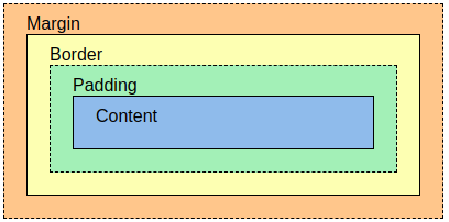
What is Box Model —
As Web Developer whatever we are writing on HTML document every content takes some space , we can define these spaces by some common terminologies like Padding , Borders , Margine etc
- The term “box model” is used when discussing a web application’s
design and layout. - It is a box that wraps around every HTML element.
- It consists of: margins, borders, padding, and the actual content.
Ex:- Margin :10px 20px ; (Landscape, Vertically)
Ex:- Padding :10px 20px 10px 20 px ; (top, right, Bottom, left)
Ex:- Border 2px solid Black ;
Importance of colors —
Colors play a significant role in the design of a website and can greatly affect the user experience. Colors can be used to create visuals, draw attention to important elements, and establish a mood or tone. They can also be used to convey brand identity and personality.
In CSS, colors can be specified in a number of ways:
- Using predefined color names
- Using hexadecimal color codes
- Using RGB values
- Using HSL values
- Using the “rgba” function
- Using the “hsla” function
- Using the “transparent” keyword
The background of an element in CSS refers to the area behind the content of an element. The background can be set to a color or image, and can be repeated or positioned as desired.
- background-color :-The background-color property in CSS is used to specify the background color of an element.
- background-image :-The background-image property is used to set one or more background images to an element.We can provide a web URL( ) or a path to the image file for the background-image property.
- background-repeat :- The background-repeat property in CSS is used to repeat the background image both horizontally and vertically.It also decides whether the background-image will be repeated or not.
Ex- repeat ,repeat-x ,repeat-y ,no-repeat
- background-attachment :-The property background-attachment property in CSS is used to specify the kind of attachment of the background image with respect to its container. It can be set to scroll or remain fixed. It can be applied to all HTML elements.
Ex- scroll, fixed
- background-size :-This Property specify the size of image ,by which we can define size of Background image it can be .
Ex- Cover , contain, 200px 100px;
What is Margin —
When no defined borders surround an element, a space is created using the CSS margin attributes. You have complete control over the margins through CSS. Each side of an element can have its margin set using attributes (top, right, bottom, and left).
- 1. margin-top
2. margin-right
3. margin-bottom
4. margin-left - auto — when the browser calculates the marginThe auto Value:
margin property can be set to auto to center the element within its container horizontally.
This way element will then take up only the specified width, and the remaining space will be divided equally between the left and right margins. - length — specifies a margin in terms of px, pt, cm, etc.
- % — specifies a margin in % of the width of the containing element
- inherit — specifies that margin would be inherited from the parent element
—* Negative values are also allowed *—
Shorthand Property :
- margin : 10px 20px (Horizontal Vertical)
- margin : 10px 20px 30px 40px (top right bottom left)
Margin Collapse
In some cases, elements’ top and bottom margins are combined into a single margin that is equal to the larger of the two margins.
The margins on the left and right do not undergo this! It is only top and bottom margins.
h1 {
margin: 0 0 50px 0;
}
h2 {
margin: 20px 0 0 0;
}- the <h1> element has a bottom margin of 50px and the <h2> element has a top margin
set to 20px. - Common sense would seem to suggest that the vertical margin between the <h1> and the <h2> would be a total of 70px (50px + 20px). But due to margin collapse, the actual margin ends up being 50px.
What is Padding—
Padding properties are used to generate space around an element’s content, inside of any defined borders. you have full control over the padding. There are properties for setting the padding for each side of an element (top, right, bottom, and left).
- padding-top
padding-right
padding-bottom
padding-left - — length — specifies a padding in px, pt, cm, etc.
— % — specifies a padding in % of the width of the containing element
— inherit — specifies that the padding should be inherited from the parent element
— * Negative values are not allowed * —
Shorthand Property :
- Padding :10px 20px 10px 20 px ; (top, right, Bottom, left)
- Padding :10px 10px 20 px ; (top, right-left ,Bottom )
Text Properties in CSS
- Text-color :- used to set the color of the text
- Text-alignment :-Text alignment property CSS has the following properties
● text-align
● text-align-last
● direction
● unicode-bidi
● vertical-align - Text-decoration :- The text-decoration property specifies the decoration added to text.
— text-decoration-line : Sets the kind of text decoration to use (like underline, overline, line-through)
— text-decoration-color : Sets the color of the text decoration.
— text-decoration-style : Sets the style of the text decoration (like solid, wavy, dotted, dashed, double)
— text-decoration-thickness : Sets the thickness of the decoration line - Text-transformation :- The text-transform property controls the capitalization of text.
— none : No capitalization. The text renders as it is. This is the default.
— capitalize : Transforms the first character of each word to uppercase.
— uppercase : Transforms all characters to uppercase.
— lowercase : Transforms all characters to lowercase.
- Text-indentation :-An indentation is the space at the beginning of a line of writing. The text-indent property specifies the indentation of the first line in a text-block.
- Letter spacing :-This property is used to specify the space between the characters of the text.The size can be given in px.
- Line height :- This property is used to set the space between the lines.
- Word spacing :- The word-spacing property increases or decreases the white space between words
Font in CSS —
- Font color (Not Supported)
- Font family :-
- Font size
- Font variant
- Font weight
— These are some major font characteristics —
● Font color: The text’s color can be altered with this property. (Standalone Attribute)
● Font family : This feature can change the font face.
● Font size: It is possible to change the font size with this feature.
● Font design: This setting is used to obliquely, boldly, or italicize the typeface.
● Font-variant: Small-caps effect is produced by this feature of the CSS font variant.
● Font weight: This attribute is used to modify the font boldness and lightness.
Display property —
- The display property specifies the display behavior (the type of rendering box) of an element.
In HTML, the default display property value is taken from the HTML specifications or from the browser/user default style sheet. The default value in XML is inline, including SVG elements. - display : Hidden; —This will Hide the element from webpage and not visible but we can click on them.
- display : none; — This will Remove the element from webpage and even we Cannot click on them.
- display : inline; —this will make block element as inline.
- display : block; — this will make inline element as block.
- display : inline-block; This can make elements such that we can set height & width of elements. it can be. :—
— Width
— Min-Width
— Max-Width
— Height
— Min-Height
— Max-Height
— Box-Sizing :-Padding & border are included in the width and height of an element if box -Sizing :border-box; . It ensure that width we provided is not changed including padding and margine.
— Overflow :hidden; This can hide unnecessary text which come out from box having fixed height and width
Pseudo Classes & elements —
Pseudo-Classes are used to select element based on their state , Such as When the element is hovered over, when it has focused ,or when it is the first or last child of its parent element.
- :hover :-The hover selector is for selecting the elements when we move the mouse onthem. We can use it on almost every HTML element.
- :focus :-The focus selector is used to select the element that has focus.
- :link :-The link selector is used to select unvisited links.
- :visited :-The Visited Selector is used to select visited links
- :active :-The active selector is used to select active element mean it select element on which we have hold on left click of mouse.
- :first-child :-The first-child selector is used to select the specified selector, only if it is the first child of its parent.
- :lang():-The lang() selector is used to select elements with a lang attribute with the specified value.
- :nth-child() :-The nth-child(n) selector matches every element that is the nth child of its parent.
- :invalid :- The invalid selector selects form elements with a value that does not validate according to the element's settings.
- :not(selector) :- The
:not(selector)selector matches every element that is NOT the specified element/selector.
<!DOCTYPE html>
<html lang="en">
  <head>
    <meta charset="UTF-8" />
    <meta name="viewport" content="width=device-width, initial-scale=1.0" />
    <title>Document</title>
    <style>
      td {
        box-sizing: border-box;
        width: 100px;
        height: 100px;
      }
      table {
        background-color: rgb(255, 191, 53);
        text-align: center;
      }

      td:hover {
        background-color: rgb(255, 1, 1);
        color: azure;
        font-size: larger;
        cursor: pointer;
        box-sizing: border-box;
      }
      input:focus {
        background-color: rgb(251, 177, 177);
      }
      a:link {
        text-decoration: none;
        font-size: larger;
        color: rgb(255, 255, 255);
        background-color: rgb(255, 169, 169);
      }
      a:active {
        text-decoration: none;
        font-size: larger;
        color: rgb(2, 10, 255);
      }
      a:visited {
        text-decoration: none;
        font-size: larger;
        color: rgb(255, 8, 8);
      }

    </style>
  </head>

  <body>
    <header>
      <table border="1px">
        <caption>
          TESTING
        </caption>
        <thead class="h1">
          <td>1</td>
          <td>2</td>
          <td>3</td>
          <td>4</td>
          <td>5</td>
          <td>6</td>
        </thead>
        <tbody class="h1">
          <td>Hack</td>
          <td>zack</td>
          <td>pack</td>
          <td>nack</td>
          <td>herpex</td>
          <td>nzxt</td>
        </tbody>
        <tbody class="h1">
          <td>Robin</td>
          <td>Sapna</td>
          <td>cms</td>
          <td>Sapna</td>
          <td>Sapna</td>
          <td>nisue</td>
        </tbody>
      </table>
      <label for="name">ENTER NAME</label>
      <input
        type="text"
        id="name"
        style="font-size: larger; margin-top: 15px"
      />
      <br />
      <a href="https://www.youtube.com/channel/UCDYphMVjopgkG9v4WYNr1ag" target="_blank"> My YouTube</a>
    </header>
  </body>
</html>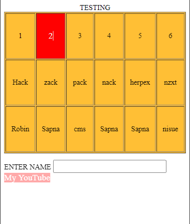
Pseudo Elements —
CSS allows developers to create special types of selectors called pseudo elements, which can be used to style specific parts of an HTML element.
Some of the pseudo-elements are-
- ::first-line :- The first-line pseudo-element is used to add a special style to the first line of a text.
** It will only be applied to block-level elements. **
- ::first-letter :- The first-letter pseudo-element is used to add a special style to the first letter of a text.
** It will only be applied to block-level elements. **
- ::after :- The ::after pseudo-element can be used to insert some content and apply styles after the content of an element.
- ::before :- The ::before pseudo-element can be used to insert some content and apply styles before the content of an element.
- ::marker :-The marker selector selects the marker of a list item.and we can apply style to that markers
- ::selection :-The ::selection pseudo-element matches the portion of an element that is selected by a user.
Difference between pseudo-class and pseudo elements —
Pseudo-classes and pseudo-elements are both used in CSS to select
elements on a web page that cannot be selected using regular CSS selectors.
pseudo-classes select elements based on their state or characteristics, while
pseudo-elements select specific parts of an element.
Pseudo-classes are defined by adding a colon (:) followed by the name of the
pseudo-class after the element you want to target.
Pseudo-elements are defined by adding two colons (::) followed by the name
of the pseudo-element after the element you want to target.
Gradient —
- Linear gradient( Hoes down/up/rignt/diagonal )
- Radial gradient( define at center )
- Conic gradient( rotate around a center point )
Linear gradient —
To create a linear gradient you must define at least two color stops. Color stops are the colors you want to render smooth transitions among. You can also set a starting point and a direction (or an angle) along with the gradient effect.
background-image: linear-gradient(direction/angle, color-stop1, color-stop2, …); <style>
.box{
width: 500px;
height: 500px;
/* this is the gradient property i define here */
background-image: linear-gradient(to right, rgb(246, 255, 0)1%, rgb(255, 0, 0) 100%);
}
</style>
<body>
<div class="box">
</div>
</body>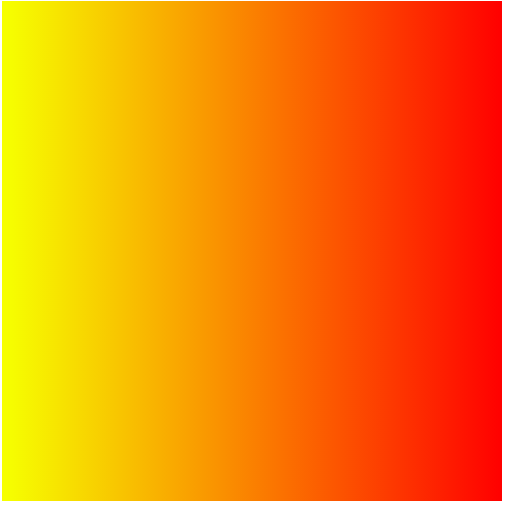
Radial gradient —
It is defined by its center.
To create a radial gradient you must also define at least two color stops.
By default, shape is ellipse, size is farthest-corner, and position is center.
background-image: radial-gradient(shape size at position, start-color, …,
last-color);
<style>
.box{
width: 500px;
height: 500px;
/* this is the gradient property i define here */
background-image: radial-gradient(circle , red 1% , yellow 100%);
}
</style>
</head>
<body>
<div class="box">
</div>
</body>
Conic Gradients —
A conic gradient is a gradient with color transitions rotated around a center point.
To create a conic gradient you must define at least two colors.
By default, angle is 0deg and position is center.
background-image: conic-gradient([from angle] [at position,] color [degree], color [degree], ...);<!DOCTYPE html>
<html lang="en">
<head>
<meta charset="UTF-8">
<meta name="viewport" content="width=device-width, initial-scale=1.0">
<title>Transistion</title>
<style>
.box{
height: 500px;
width: 500px;
background-color: red;
/* For browsers that do not support gradients */
background-image: conic-gradient( from -246deg at center,red 0%, yellow 32%, pink 56%, red 95%);
</style>
}
</head>
<body>
<div class="box">
</div>
</body>
</html>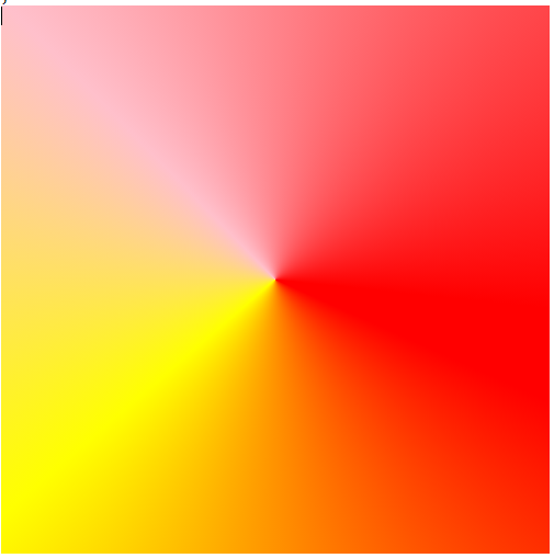
Transaction —
CSS transitions allow you to change property values smoothly, over a given duration.To create a transition effect, you must specify two things:
the CSS property you want to add an effect to
the duration of the effect
Note: If the duration part is not specified, the transition will have no effect, because the default value is 0.
<!DOCTYPE html>
<html lang="en">
<head>
  <meta charset="UTF-8">
  <meta name="viewport" content="width=device-width, initial-scale=1.0">
  <title>Transistion</title>

  <style>
    .box{
      background-color: blueviolet;
      height: 90px;
      width: 100px;
     /* these are transistion properties */
      transition: height width background-color;
      transition-duration: 3s;
      transition-delay: 0.1s;
      transition-timing-function: ease-in-out;

    }

    .box:hover{
      height: 300px;
      width:300px;
      background-color: rgb(238, 255, 1);

    }

  </style>
</head>
<body>

  <div class="box">
  </div>

</body>
By this method we can apply single same transition on all or different properties( height, width etc) of elements
- if you want to apply different transition on each different attributes( height, width etc) of element.then we have to uses this Short-hand properties —
transistion : ( property duration timing_function Delay ) ;- We getting little difference in code ,when we specify different transition for each property of element.
- with comma separated we can define different properties for different elements like —
transistion : ( property duration timing_function Delay ), ( property duration timing_function Delay )....... ;The transition-timing-function property can have the following values:
- ease — specifies a transition effect with a slow start, then fast, then endslowly (this is default)
- linear — specifies a transition effect with the same speed from start to end
- ease-in — specifies a transition effect with a slow start
- ease-out — specifies a transition effect with a slow end
- ease-in-out — specifies a transition effect with a slow start and end
- cubic-bezier(n,n,n,n) — lets you define your own values in a cubic-bezier function
Animation Properties—
An animation lets an element gradually change from one style to another. You can change as many CSS properties you want, as many times as you want. To use CSS animation, you must first specify some keyframes for the animation.
When you specify CSS styles inside the @keyframes rule, the animation will gradually change from the current style to the new style at certain times.
   @keyframes robin {
      from{
        left: 0px;
       background-color: blueviolet;
      }

      to{
        left: 100px;
        width: 55px;
       background-color: aqua;
      }
    }
To get an animation to work, you must bind the animation to an element.
  .box{
      background-color: blueviolet;
      height: 90px;
      width: 100px;
      animation-name: robin;<------------Binded here
      animation-duration: 6s;
      animation-iteration-count: infinite;
    }
/* And then we can apply different animation properties according to our need */
The animation-delay property specifies a delay for the start of an animation. Animation delay can also have negative values.
The animation-iteration-count property specifies the number of times an
animation should run. This can also be infinite.The animation-direction property specifies whether an animation should be played forwards, backwards or in alternate cycles. The animation-direction property can have the following values:
- normal — The animation is played as normal (forwards). This is default
- reverse — The animation is played in reverse direction (backwards)
- alternate — The animation is played forwards first, then backwards
- alternate-reverse — The animation is played backwards first, then forwards
The animation-timing-function property specifies the speed curve of the animation. The animation-timing-function property can have the following values:
- ease — Specifies an animation with a slow start, then fast, then end slowly (this is default)
- linear — Specifies an animation with the same speed from start to end
- ease-in — Specifies an animation with a slow start
- ease-out — Specifies an animation with a slow end
- ease-in-out — Specifies an animation with a slow start and end
- cubic-bezier(n,n,n,n) — Lets you define your own values in a cubic-bezier function
CSS animations do not affect an element before the first keyframe is played or after the last keyframe is played. The animation-fill-mode property can override this behavior. The animation-fill-mode property specifies a style for the target element when the animation is not playing (before it starts, after it ends, or both).
- none — Default value. Animation will not apply any styles to the element before or after it is executing
- forwards — The element will retain the style values that is set by the last keyframe (depends on animation-direction and animation-iteration-count)
- backwards — The element will get the style values that is set by the first keyframe (depends on animation-direction), and retain this during the animation-delay period
- both — The animation will follow the rules for both forwards and backwards, extending the animation properties in both directions.
Animation Shorthand Property
- Look at the animation mentioned in the div below:
div {
animation-name: example;
animation-duration: 5s;
animation-timing-function: linear;
animation-delay: 2s;
animation-iteration-count: infinite;
animation-direction: alternate;- To achieve this in shorthand we will use the following:
div {
animation: example 5s linear 2s infinite alternate;
}
🔥Introduction to media queries—
Media queries are a feature of CSS that allows you to apply different styles to a webpage based on the characteristics of the device it is being displayed on. This can be useful for creating responsive designs that look good on a variety of different devices, such as smartphones, tablets, and desktop computers.

Advantages to using media queries in your web development projects: —
- Responsive design
- Customized user experience
- Improved performance
- Enhanced accessibility
- Simplified maintenance
Before We are going to understand general syntax of Media queries ,We need to understand some Very Important Terminology(View Port), so what is View port ? Actually what the user can see area on Browser windows is called Vieport. and it vary device to device — As device screen size increase Viewport increases and Vice versa.
In earlier days when mobile phones /tablets was not introduce ,Web Developer design only static websites which was only for computers(Large viewport) .
Now a days Latest HTML5 Provides a feature with this we can set the.viewport size for different devices by using Meta Tags.
Meta Tags : — using meta tags we can provide extra information about our web page to the browser
<meta name="viewport" content="width=device-width, initial-scale=1.0" />Browser can read Viewport property from meta as shown above whose says (content=”width=device-width) means content will shown only under device-width (Viewport =device-width)
- *if we not mention these meta tags in our webpage some CSS like Media quries etc will not work on mobile browsers**
To understand how to write media queries for different screens let’s change the
background color and the text based on the screen size. So on designing this
simple webpage we will be clear on how to separate the CSS for different screen
sizes using media queries.
General Suntax of Media queries
@media mrdia_target media _feature and (media_feature:value){
/*styles*/
}
<!DOCTYPE html>
<html lang="en">
<head>
<meta charset="UTF-8" />
<meta name="viewport" content="width=device-width, initial-scale=1.0" />
<title>Document</title>
<style>
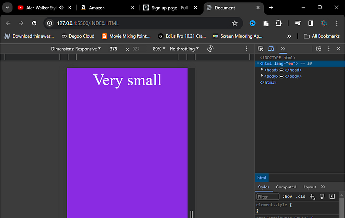
@media (max-width:400px) {
body{
background-color: blueviolet;
}
div::after{
content:"Very small";
color: aliceblue;
display: block;
text-align: center;
font-size: 50px;
}
}
/* @media(400px < width < 700px) this will also we can use */
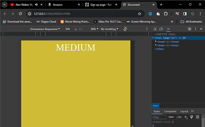
@media(min-width:400px) and (max-width:700px)
{
body{
background-color: rgb(207, 187, 54);
}
div::after{
content:"MEDIUM";
color: aliceblue;
display: block;
text-align: center;
font-size: 50px;
}
}
@media (width>=700px) {
body{
background-color: rgb(252, 36, 17);
}
div::after{
content:"LARGE";
color: aliceblue;
display: block;
text-align: center;
font-size: 50px;
}
}
</style>
</head>
<body>
<div>
</div>
</body>
</html>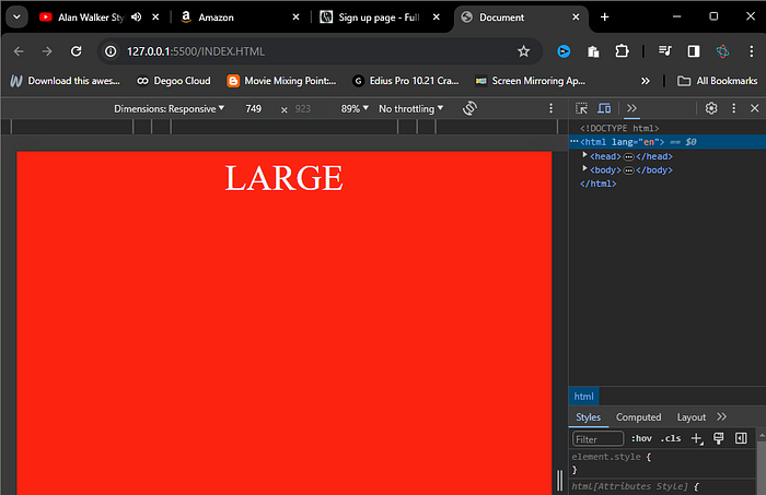
Media queries have become popular for several reasons:
- The increasing number of devices.
- The rise of mobile browsing.
- Improving User Experience.
- Better accessibility.
- Better Performance.
- Print Support
CSS Layout —
It is a very important part of web design which allows the developer to position the elements on a web page so that the web page can be visually appealing and user friendly. In other words, we can say that it is a process of using CSS to control the position and size of elements on a web page.

Benefits of using CSS Layout
- 1. Better presentation and structure
2. Better accessibility
3. Flexible and responsive
4. Reusability
5. Browser compatibility
Types of CSS Layout
- 1. Normal Flow
2. Float
3. Position
4. Flex
5. Grid
Normal Flow
It is the default layout model in which elements are rendered in the order they are written in the HTML file. It is the default and simplest layout model.
<body>
  <div>
    <h1>This is normal flow property</h1>
    <a href="#">Google</a>
    <a href="#">Facebook</a>
    <button>Submit</button>
    <hr>
    <p>Here we can see the noraml flow of elements </p>
    <button>Submit</button>

  </div>
</body>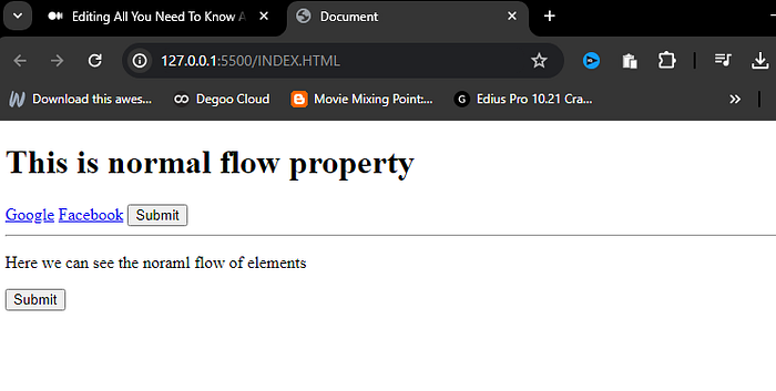
Float
Float property specifies how we can position an element within the container. Float is majorly used when we want to align elements horizontally next to each other.
These are the most used properties of float to position the element-
- none
- left
- right
none
This is the default property set on the element which means that the element will not float anywhere and will be there according to the normal document flow.
left
This property will float (position) the element to the left side of the container, instead of
positioning the element with the default layout flow.
right
This property will float (position) the element to the right side of the container, instead of
positioning the element with the default layout flow.
  <style>
    div{
      border: 2px solid rgb(255, 0, 0);
      text-align: center;
    }
button{
margin: 1em;
float:right ;
padding: 5px 10px 5px 10px;
}
  </style>
</head>

<body>
  <div>
    <button>Submit</button>
    <p>Here we can see the noraml flow of elements Lorem Lorem, ipsum dolor sit Lorem ipsum dolor sit amet, consectetur adipisicing elit. Tenetur, error maiores nisi molestias eum, ut maxime quos obcaecati possimus voluptates minima sequi temporibus harum vel, odio id dolorum reiciendis ratione? amet consectetur adipisicing elit. Ipsa reprehenderit maxime fugiat velit, inventore nesciunt enim sed est eligendi totam placeat ex adipisci magni illum quia sit. Animi itaque illo vitae, eveniet quos porro velit modi dolor pariatur quidem accusamus molestiae autem eveniet nobis eum! </p>
    <button>Submit</button>

  </div>
</body>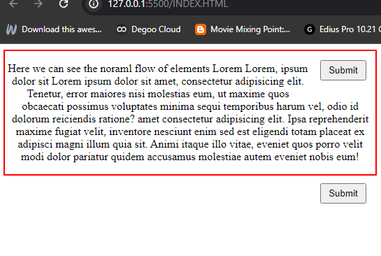
Overflow and Z-index —
The overflow property in CSS determines what happens to content that is too large to fit in an element’s box.
The overflow property has the following values:
- visible — Default. The overflow is not clipped. The content renders outside the element’s box
- hidden — The overflow is clipped, and the rest of the content will be invisible
- scroll — The overflow is clipped, and a scrollbar is added to see the rest of the content
- auto — Similar to scroll, but it adds scrollbars only when necessary
<!DOCTYPE html>
<html lang="en">
<head>
  <meta charset="UTF-8">
  <meta name="viewport" content="width=device-width, initial-scale=1.0">
  <title>Document</title>
  <style>
    .main{
    overflow:auto ;
      padding: 1em;
      text-align: center;
    color: #f5f5f5;
      background-color: rgb(147, 138, 135);
      height: 500px;
      width: 500px;
    }
  </style>
</head>
<body>
  <div class="main">
    <p>Lorem ipsum dolor sit amet consectetur adipisicing elit. Quo, id dese lorem Lorem ipsum, dolor sit amet consectetur adipisicing elit. Quaerat, inventore! Est laudantium, aliquid quia molestias fugit doloremque similique repellendus aliquam officiis debitis deleniti, qui libero vel repellat quae, ab aut!lorem300
      Lorem ipsum, dolor sit amet consectetur adipisicing elit. Amet sequi quaerat deserunt totam non molestias praesentium vitae, illo hic voluptatibus, deleniti natus! Repellat voluptate itaque eaque, ipsum incidunt molestiae adipisci ex voluptates dolor saepe temporibus molestias blanditiis at a provident, labore totam iusto? Nostrum, fugit. Sed saepe accusamus non eius? Beatae in reprehenderit, voluptatem nobis fugit repellat nostrum. Ullam quisquam natus enim culpa autem eius non, dolor nobis! Harum placeat ea dolor officia blanditiis eaque totam eveniet. Asperiores officia fugit, beatae blanditiis nisi ducimus tempora totam ex soluta laborum distinctio deserunt consectetur unde incidunt cumque ipsum, nostrum perferendis quas, aperiam dolorem vero corporis nemo. A, voluptatum? Dolor dolorum fuga voluptatibus deleniti, dolorem eligendi doloribus cupiditate vitae maxime hic officiis ratione recusandae, eaque animi, debitis assumenda vero? Consequatur illo, nulla ratione atque, iste dicta modi vel, quo consectetur nihil odio veniam cumque nobis repellat. Dicta nobis nisi rem vero voluptates id iusto quas, nulla eos magni assumenda unde accusamus asperiores, nesciunt voluptate. Debitis in officiis animi voluptate voluptates ipsum fugit quasi provident tempore aspernatur nemo sapiente, non reprehenderit. Hic, debitis ab. Reprehenderit earum, ipsam nesciunt ab totam provident laboriosam nam labore perspiciatis dolore. Porro sit accusamus hic dolor reiciendis laudantium fugit vitae iusto, dolorem ipsam deleniti odio, omnis eum, explicabo perspiciatis inventore molestiae quae aliquam nemo. Aut fugiat sunt voluptatem ex quas quia excepturi, iste est doloribus ipsa eius minima maxime repellendus, rem quae, aliquid saepe eveniet corrupti distinctio. Optio sapiente consectetur quia, expedita incidunt nihil laboriosam ipsa similique fugiat labore, quibusdam quasi assumenda mollitia repellat quisquam laudantium animi. Aliquid esse illo tenetur tempore soluta sunt perferendis, veritatis, illum a eligendi eius ea odit ullam fugiat nam temporibus quam beatae. Voluptatum, quaerat modi. Similique facilis, dolorum laudantium dolores aliquid commodi. Vero totam odit, asperiores neque odio optio qui fugit? Reprehenderit, vero! runt? Repellendus corrupti nemo provident ducimus earum explicabo iure, labore rem repellat, a tempora ab adipisci at! Dolorem, minima non, illo qui eaque ex fuga praesentium nobis ipsam natus commodi veniam distinctio eum. Delectus sint illum iure atque sed doloremque eaque laborum? Illo molestiae fuga nam consectetur dolore. Maiores dignissimos et asperiores reiciendis, non, nostrum aperiam iure cupiditate nobis mollitia odio consequuntur fugiat error eum voluptates doloremque. Quidem quisquam reiciendis omnis sapiente autem vero architecto, in neque impedit consequatur vel amet dolores totam enim aperiam expedita! Inventore reprehenderit praesentium nisi!</p>
  </div>
</body>
</html>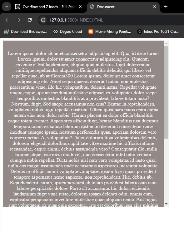
CSS Z-Index.
The z-index property in CSS is used to specify the stack order of an element. An element with a higher z-index value will be placed in front of an element with a lower z-index value.
The value of the z-index property is an integer, the element with a higher number is placed on top of the elements with lower numbers.
Flex Box—
flexbox offers a varity of properties to create layout effciently . Generally we can categorise the flexbox properties into two parts . The Flexible Box Layout Module, which is popularly known as Flexbox, is a powerful way of designing the efficient and responsive layout in CSS.
Benefits of using Flexbox
It helps us to create one-dimensional layout and provides much more flexibility and control over the layout design. It also allows us to put our elements in a row or column within our layout.
One can easily distribute the space between elements within a flex container.
Some fundamental terminologies of Flexbox
- Flex Container
- Flex Items
- Main Axis
- Cross Axis
Flexbox offers a variety of properties to create layout efficiently. Generally we can
categorise the flexbox properties into two parts-
- Flex Container Properties
- Flex Items Properties
Flex Container Property
These are the properties that are used over the flex container (parent container). Flex container properties are as follows-
- Display
- flex-direction
- flex-wrap
- flex-flow
- justify-content
- align-items
- align-content
- gap
— row-gap
— column-gap
➡️Display property _
It is used to define a flex container. After defining a flex container using display flex or inline-flex, it will enable a flex context for all its direct children and will allow users to use flex properties over the flex container and its flex items respectively.
- Difference between flex and inline-flex*
- The major difference between two is that the display:inline-flex will make the flex container display inline but will not make flex items display inline.
➡️Flex Direction Property_
It is used to define the direction in which all the flex items should be laid out. By default the flex direction of a flex container is row to which we can change by using this property.
There can be four values of a flex direction-
- row
- row-reverse
- column
- column-reverse
➡️Flex Wrap Property_
This property is used to define whether the flex items should wrap themself to fit the container width or not if the total required width of flex items are more than the flex container width.
Flex wrap can have three possible values-
- nowrap
- wrap
- wrap-reverse
➡️Flex Flow Property
It is a shorthand property for setting both flex-direction and flex-wrap properties in
one line.
Syntax- flex-flow: flex-direction flex-wrap
➡️Justify Content Property
It is used to align the flex items along with the main axis of the container within the
flexbox layout.
It can have these possible values-
- flex-start
- flex-end
- center
- space-between
- space-around
- space-evenly
➡️Align Items Property
It is used to align the flex items along with the cross axis of the container within the
flexbox layout.
It can have these possible values-
- stretch
- flex-start
- flex-end
- center
- baseline
➡️Align Content Property
This property is used to align a flex container’s lines within it when there is extra space in the cross axis, similar to that of justify-content property which works on the main-axis. There should be more than one line to function the align content.
It can have these possible values —
- stretch
- flex-start
- flex-end
- center
- space-between
- space-around
➡️Gap Property
This property defines the amount of space between the rows and columns of a flex container. The gap is a shorthand property for defining the row-gap and column-gap.
Syntax
— gap:10px;
This is similar to row-gap:10px and column-gap:10px
— gap:10px 20px
This is similar to row-gap:10px and column-gap:20px
Flex Items Property
These are the properties that are used over the flex items (child elements). Flex items properties are as follows-
- order
- flex-grow
- flex-shrink
- flex-basis
- flex
- align-self
➡️Order property
This property defines the order of a flex item within its flex container. We can use this property to set the position of individual flex items within the flex container.
The default value of order is 0 and the flex items will be sorted in ascending order.
➡️Flex grow property
This property defines the proportion of available space (size of flex container — total size of flex items) each element should take up within the container.
The value will be a positive integer (negative value is not allowed), higher the number more space the element will take up compared to the other flex items.
The default value is 0, which will have no effect on the flex growth of the element.
➡️Flex shrink property
This property defines that in which proportion a flex item should shrink if the flex container is smaller than the total size of flex items.
The value will be a positive integer (negative value is not allowed), higher the number more it will shrink in comparison to the other flex items.
The default value is 1, which means elements will shrink equally to fit the container.
➡️Flex basis property
It is used to set the initial size of the flex items before the space is distributed according to flex grow or flex shrink.
➡️Flex property
It is the shorthand property which sets the values of flex-grow, flex-shrink and flex-basis.
➡️Align self property
This property is used to align a flex item inside its flex container.
- stretch:- This is default value for the align self, which stretches the element to fill its flex container height.
- flex-start: The flex-item will be aligned at the start of the cross axis.
- flex-end: The flex-item will be aligned at the end of the cross axis.
- center: The flex-item will be aligned at the center of the cross axis.
- baseline: The flex-item will be aligned with the baseline of the cross axis.
🔥What is Grid and Difference Between Grid and Flex—
- An intersection of vertical and horizontal lines is known as a grid.
- Major sections of a page are separated using CSS Grid layout.
- A grid-based layout system with rows and columns is provided by the grid attribute. It eliminates the need for positioning and floating, making web page creation simple.
- The grid layout enables us to construct grid structures represented in CSS rather than HTML.
- The user can align the pieces into rows and columns like a table.But using the CSS grid to construct a layout is simpler than using tables.
Terminologies associated with Grid:
- Element
- Row
- Column
- Gap
- Line
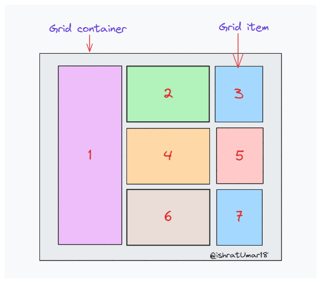
Grid Container:
- Grid containers are made up of grid elements that are arranged in
columns and rows. - This is a beautiful and organized arrangement for any webpage.
Properties associated with grid container
- Grid-template-rows : It simply states the height of each row.
- Grid-template-columns : It states the number of columns in the grid and it can define the width of each column. Here, there is a provision to use the specification as “auto” if all columns should have the same width.
- Align-content : vertically aligns the whole grid inside the specified
container. It can be start, center, end, space evenly, space around, space
between. - Justify-content : it aligns the whole grid inside the container. It can be
start, center, space evenly, space around, space between.
Grid items
- Grid items are actually the child elements within a container.
- A grid item appears in each column and each row of a container by
default, but you can customize the grid items to span several columns
and/or rows.
Properties associated with grid items
- Grid-row: defines on which row to place an item. You can also state here, where the item will start, and where the item will end. To place an item, you can either use line numbers, or use span to define how many columns the item will span.
- Grid-column: defines on which column the item is to be placed. Like a row, here too, it can be stated where the item will start and end. Here again, you can either use line numbers, or use span to define how many columns the item will span.
- Grid-area: For the attributes grid-row-start, grid-column-start,
grid-row-end, and grid-column-end, the grid-area property can be used
as a shorthand. - Naming grid: grid-area property can also be used to assign names to grid items.
<!DOCTYPE html>
<html lang="en">
<head>
  <meta charset="UTF-8">
  <meta name="viewport" content="width=device-width, initial-scale=1.0">
  <title>Document</title>
  <style>
.main{
  background-color: rgb(79, 84, 84);
---------------------------------------------
  /* Hrere you can see how i define  */
  display: grid;
  grid-template-columns:1fr 1fr 1fr; /* repeat(3,1fr) */
  grid-template-rows: 111px 100px 111px;
---------------------------------------------
  /* height: 500px; */
  gap: 5px;
  padding: 5px;
}
.box{
   /*height: 100px; */
   /* width: 100px; */
}
.b1{
  background-color: red;

}
.b2{
  background-color: rgb(255, 166, 0);
}
.b3{
  background-color: rgb(0, 255, 8);
}
.b4{
  background-color: rgb(0, 132, 255);
}
.b5{
  background-color: rgb(255, 0, 187);
}

  </style>
</head>
<body>
 <div class="main">
  <div class="box b1">hi Lorem Lorem ipsum  alias! ips Lorem
       ipsum dolor sit amet
       consectibus soluta deleniti ipsa. </div>
  <div class="box b2">Lorem ipsum</div>
  <div class="box b3"></div>
  <div class="box b4"></div>
  <div class="box b5"></div>
 </div>
</body>
</html>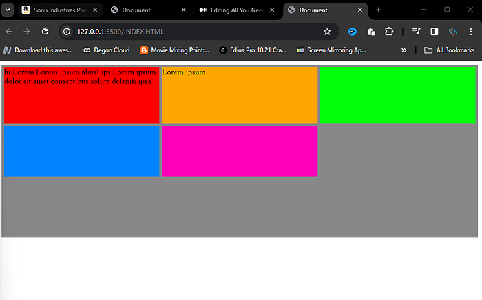
grid-template-areas: —
The grid-template-areas property specifies areas within the grid layout.
● <grid-area-name> — the name of a grid area specified with grid-area.
● dot(.) — Represents the empty space in the template.
<!DOCTYPE html>
<html lang="en">
<head>
  <meta charset="UTF-8">
  <meta name="viewport" content="width=device-width, initial-scale=1.0">
  <title>Document</title>
  <style>
.main{
  background-color: rgb(228, 163, 163);
  /* Hrere you can see how i define  */
  display: grid;

 grid-template-areas:
   "a a a"
   "b b c"
   "b b c"
   "d d c"
 ;
   grid-template-columns: 1fr 1fr 1fr ;
  grid-template-rows: minmax(auto ,50px) minmax(100px,auto) 100px 100px ;
  /* height: minmax(100px auto); */
  gap: 5px;
  padding: 5px;
}
.box{
  /* height: 50px;   */
  /* width: 100px;   */
text-align: center;
/* align-self: center; */
color: azure;
}

.b1{
  background-color: red;
  grid-area: a;

}
.b2{
  background-color: rgb(255, 166, 0);
  grid-area: b;
}
.b3{
  background-color: rgb(204, 0, 255);
  grid-area: c;
}
.b4{
  background-color: rgb(0, 132, 255);
  grid-area: d;
}

  </style>
</head>
<body>
 <div class="main">
  <div class="box b1">Header</div>
  <div class="box b2">MAIN CONTENT Lorem ipsum dolor sit amet consectetur adipisicing elit. Alias error quas quasi, illo quia blanditiis quae nesciunt? Placeat cumque dignissimos expedita at culpa iusto nesciunt nihil excepturi. Harum distinctio eligendi ipsa obcaecati nemo! Quidem, voluptatum. Quod vero dolorum voluptates lorem 500 Lorem ipsum, dolor sit amet consectetur adipisicing elit. Incidunt quia, ut impedit praesentium, quos quam illo ratione et sequatur, nemo deleniti saepe soluta repellat. Id in exercitationem voluptates pariatur rerum quidem maxime eius eos aspernatur ipsum at deserunt facilis voluptatibus, nulla voluptatem eum. consectetur dicta enim. </div>
  <div class="box b3"> ASIDE</div>
  <div class="box b4"> DESCRIPTION</div>

 </div>
</body>
</html>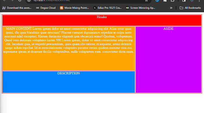
Benefits of grid :
- Grid Layout enables us to clearly distinguish between the visual display of elements and their order in the source.
- Code reduction The columns, rows, and grid tracks for your grid are built within your CSS rather than as separate HTML elements.
- Smaller file size There is no requirement for huge frameworks like Bootstrap in your projects because CSS Grid is native.
- Developmental pace CSS Grid makes prototyping quick and easy after you master the syntax.
- Two-dimensional layouts Rows and columns are respected in a two-dimensional grid. If an element’s cell cannot accommodate it, the row and/or column will expand to accommodate it. For the layout of pages and forms, a grid is excellent.
- Grids in Nests Smaller components like content sections with blog articles or the blog entries themselves can be styled using the CSS Grid Layout.
Introduction to Grid Layout—
The Grid Layout is a two-dimensional layout system for creating rows and
columns. It allows for creating flexible and responsive layouts that can adapt todifferent screen sizes and devices.
We shall look at the grid properties in two ways —
➡️Properties are to be applied on grid containers [ Parent ].
➡️ Properties are to be applied to grid items [ Children ].
⚛️Grid-template-columns —
The grid-template-columns property defines the number of columns in your grid layout, and it can define the width of each column.
The value is a space-separated-list, where each value defines the width of the respective column.
If you want your grid layout to contain 5 columns, specify the width of the 5
columns, or “auto” if all columns should have the same width.
♾️Special Units & Functions —
- repeat():-The repeat() function is used to reduce repetitive declarations.
- Fr units :- The “fr” unit in CSS is a way to divide up the available space in a grid or layout. It is used to specify how much of the space should be given to a certain element or group of elements. It represents a fraction of the available space.
- minmax() :- The minmax() function in CSS is used to set a range of values for a property. It sets a minimum and maximum value for a property.
⚛️Grid-template-rows —
The grid-template-rows property defines the height of each row. It is used to define the number of rows and their size in a grid container.
⚛️GRID AREA(Short_hand)
This property is a shorthand for the following CSS properties:
/*grid-row-start: 4;
 grid-column-start:1 ;
 grid-row-end: 5;
 grid-column-end: 2; */

--short hand--
 grid-area: 4/1/5/2;
⚛️Grid-template (Short_hand)
The grid-template property in CSS is a shorthand property for setting the
grid-template-rows, grid-template-columns, and grid-template-areas
properties all at once. It allows you to define the structure of a grid layout in a simple way.
The order of values in the grid-template property is as follows:
● grid-template-rows
● grid-template-columns
● grid-template-areas
The order should be : grid-template-rows / grid-template-columns /
grid-template-areas
/* grid-template-columns: repeat(auto-fit, minmax(150px ,1fr));
  grid-auto-rows: 100px; */
  grid-template:100px /repeat(auto-fit, minmax(150px ,1fr));
display: grid;
/* grid-template-columns: 1fr 1fr 1fr; */
/* grid-template-rows: 100px 100px 100px 100px; */
/* grid-auto-rows: 100px; */
/* grid-template-areas:
"a a a "
"c b b"
"c b b"
"d d d "
; */
---Shorthand---
grid-template: "a a a" 100px "c b b" 100px "c b b" 100px "d d d "100px /1fr 1fr 1fr ;➡️Some extra property —
- grid-auto-rows* :-this defines the heigth of rows
- grid-auto-rows* :-this defines the width of coloums
- Auto-fit Vs Auto-fill When using
minmax()function, theauto-fitkeyword will expand the grid items to fill the available space. Whileauto-fillwill keep the available space reserved without altering the grid items width.
display: grid;
grid-template-columns: repeat(auto-fill, minmax(150px ,1fr));
grid-auto-rows: 100px;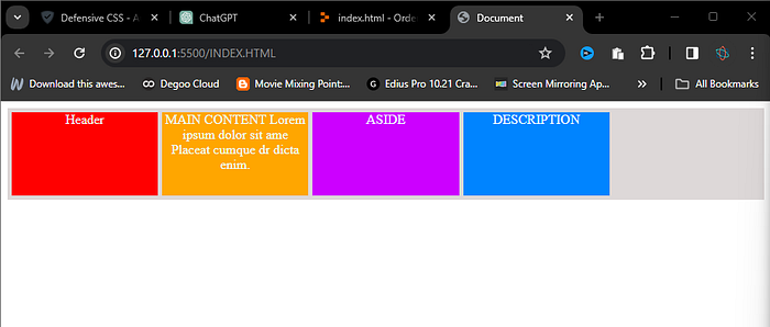
  display: grid;
  grid-template-columns: repeat(auto-fit, minmax(150px ,1fr));
  grid-auto-rows: 100px;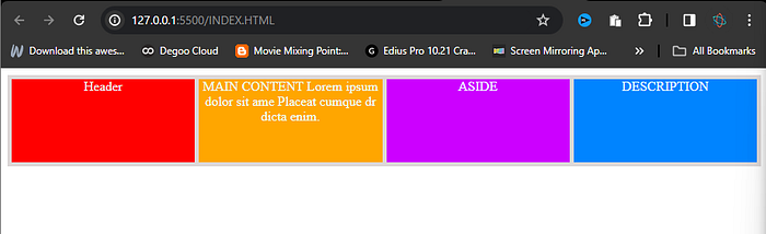
🔡Justify-items —
The justify-items property in CSS is used to align the grid items along the horizontal (x) axis within their grid cell. It applies to all grid items within the grid container.
● start — aligns items to be pushed to the start edge of their cell
● end — aligns items to be pushed to the end edge of their cell
● center — aligns items in the center of their cell
● stretch — fills the whole width of the cell (this is the default)
🔡align-items —
The align-items property in CSS is used to align the grid items along the vertical (y) axis within their grid cell. It applies to all grid items within the grid container.
● start: Aligns the grid items to the top of the grid cell.
● end: Aligns the grid items to the bottom of the grid cell.
● center: Aligns the grid items to the center of the grid cell.
● stretch: Stretches the grid items to fill the entire height of the grid cell.
- grid-column-start and grid-column-end properties are used to specify the
starting and ending of an grid-item along the horizontal (x) axis. - grid-row-start and grid-row-end properties in CSS are used to specify the startingand ending of an grid-item along the vertical (y) axis.
*️⃣justify-self —
The justify-self property is used to align a specific grid item along the horizontal (x) axis within its grid cell.
● start — aligns the grid item to be flush with the start edge of the cell
● end — aligns the grid item to be flush with the end edge of the cell
● center — aligns the grid item in the center of the cell
● stretch — fills the whole width of the cell (this is the default)
*️⃣Align-self —
The align-self property is used to align a specific grid item along the vertical (y) axis within its grid cell.
● start — aligns the grid item to be flush with the start edge of the cell
● end — aligns the grid item to be flush with the end edge of the cell
● center — aligns the grid item in the center of the cell
● stretch — fills the whole width of the cell (this is the default)
